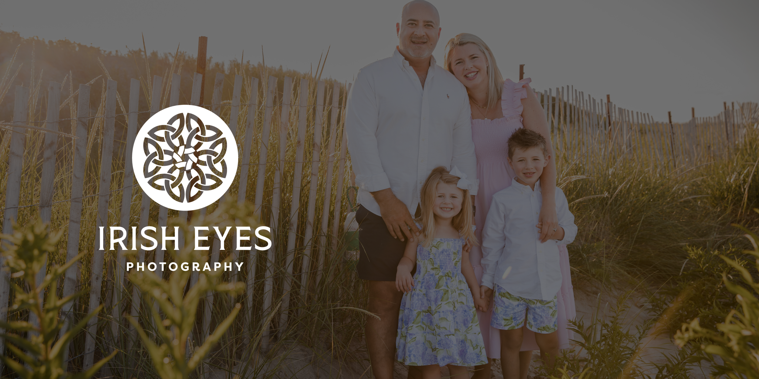
DESIGN

Irish Eyes Photography

Our art director and designer @bigbadindustries had the pleasure of working with Kerry Railey of Irish Eyes Photography in refreshing her visual brand. After 15 years in business, this is a third evolution of the Irish Eyes look and feel.In this iteration, we sought to create a “modern Celtic” vibe while carrying forward some familiar elements from earlier versions of the logo and colors.
⠀⠀⠀⠀⠀⠀⠀⠀⠀
Located in Hingham, MA, the color palette is clearly inspired by Irish roots, and evokes the coastal locale. The logo is meant to reflect Kerry’s authentic, approachable, down-to-earth personality and photographic style.

BRAND GUIDE

  • I had the pleasure of working with Gili on a branding refresh. This included a new logo and brand colors. From start to finish, Gili was impressively professional, letting me know what to expect at each turn and always being incredibly communicative about her timing (a breath of fresh air in my experience of working with other creatives!). Gili was warm, personable, and listened so carefully. I was particularly impressed by how she was able to navigate ALL the thoughts I had about my logo and turn it into a cohesive, clear branding. Admittedly for this experience, I was a bit all over the place with which direction to go in but with graceful patience, Gili was able to guide me to the end result. I've listed out lots of reasons why Gili is great to work with, but I believe this last one is probably the most important. When you hire professionals like Gili, you get someone who can help you make sense of all the thoughts floating around in your brain. This was invaluable to me. The end result is perfection. My clients and followers can't stop raving about how good the update looks and I get excited every time I update anything with the new colors. I legitimately could not be happier with this experience. I highly, highly recommend Gili for your project.

    — KERRY RAILEY

Previous
Previous

JFS. ⟶

Next
Next

Therapy with Jolene. ⟶